- Design Courses
- Beginner
About this Workshop
In this workshop, we’ll be discussing responsive design, where content renders well and remains usable on a variety of devices and viewport sizes.
On previous projects, you may have been asked to design with a specific screen in mind, whether a desktop, tablet, or mobile device. And sometimes, especially when designing a mobile app, this approach can be appropriate.
For websites, however, it’s usually best to work with a single design and consider how that design transitions from screen to screen.
What you'll learn
- Define responsive design
- Define media query
- Define breakpoint
- List rules for working with mobile body copy
- Identify when responsive images need art direction
Teacher
-
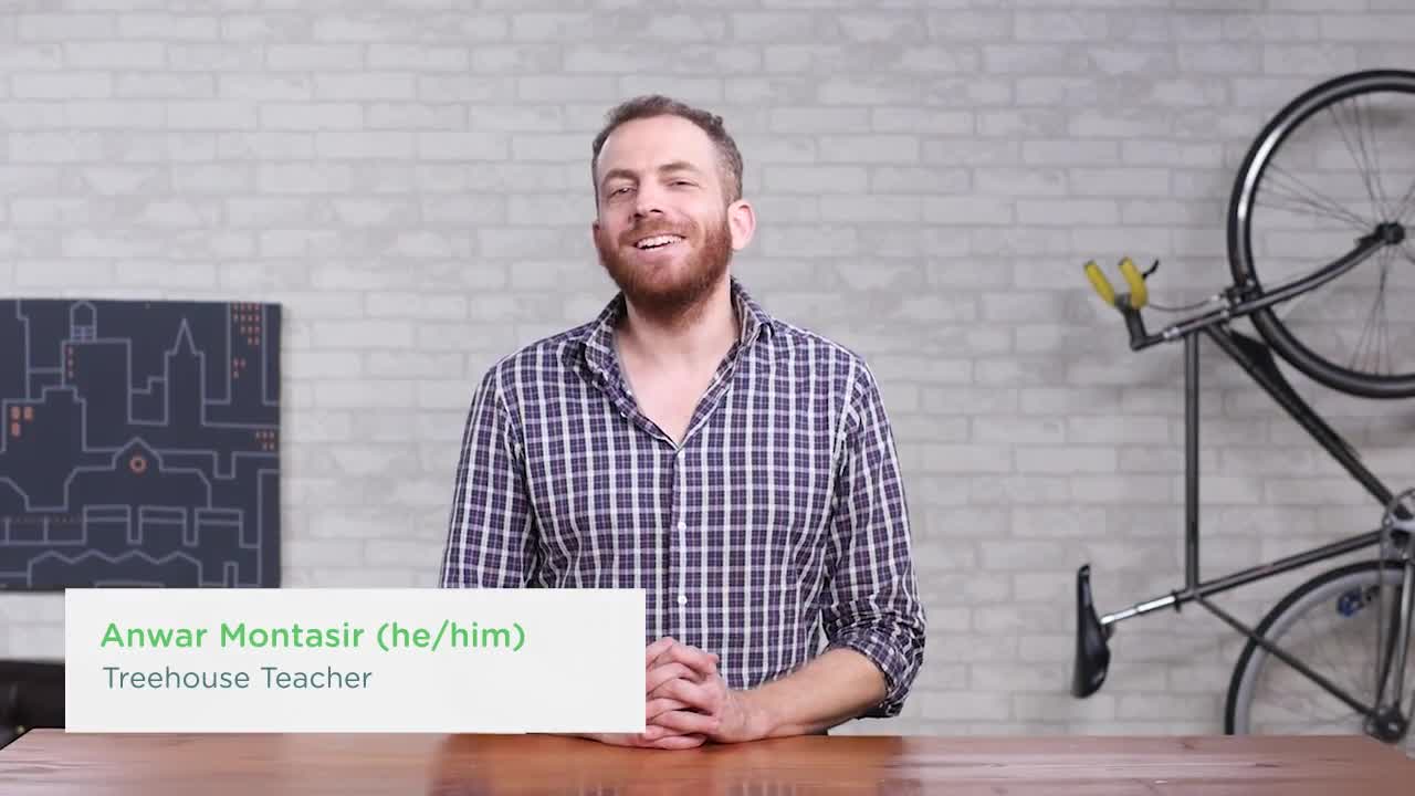
Anwar Montasir
Anwar Montasir is a UX Design, Front End Web Development, and Full Stack JavaScript instructor.