Welcome to the Treehouse Community
Want to collaborate on code errors? Have bugs you need feedback on? Looking for an extra set of eyes on your latest project? Get support with fellow developers, designers, and programmers of all backgrounds and skill levels here with the Treehouse Community! While you're at it, check out some resources Treehouse students have shared here.
Looking to learn something new?
Treehouse offers a seven day free trial for new students. Get access to thousands of hours of content and join thousands of Treehouse students and alumni in the community today.
Start your free trial
ahl
1,935 PointsCritice for my PSD website.
Hi, I have been trying to create a website in Photoshop, that I will code later. I really wanna get some critice on it, before I start coding. Keep in mind that i'm not really a great designer, in any ways :) As you may notice, it's not completly finished.. :) http://adamhyldkrog.com/design.1.jpg
7 Answers
Mike Miello
5,181 Pointslooking good Adam! I was just thinking that maybe adjusting the headlines to match one single line would make it feel more structured? In my screenshot, I drew 3 lines where your text begins http://d.pr/i/tgsS. Maybe try to get them to fall on the same line?
Mike Miello
5,181 PointsNice...also consider doing the same with the logo?
As far as colors, the one thing sticks out to me is that you used many different greens. (gradient header, buttons, titles) all have different colors. Maybe try to simplify them? Have the buttons and titles be the same green as the dark end of one of your gradients?
But with colors, there's no right/wrong way. Just experiment and experiment!
James Barnett
39,199 PointsNot a big fan of starting from a PSD comp. Here are a few better workflows
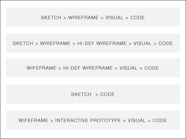
source: http://webdesign.tutsplus.com/tutorials/workflow-tutorials/a-beginners-guide-to-wireframing/
Vinícius Barcelos
1,225 PointsHey man, looking good, try to align your design to vertical line guides. And improve your navigation font! Keep working!
ahl
1,935 PointsHi Michael!
Thanks for your answer. I just updated the design. http://adamhyldkrog.com/design2.png Does this look better? Also, what do you think about the color scheme? It's one of the things I find hardest to choose.
John Locke
15,479 PointsThe thing that jumps out to me is that the text alignment is really haphazard. For example: "Need a Reliable host" and the text below don't have alignment to either left or right. Two of the three footer headers are on one level, the third is not. The lists below the footer headers are not aligned to left, right, or center. I would choose a set of rules for text alignment and follow them throughout. Design to a grid of some sort.
ahl
1,935 PointsI have now tryed aligning the text a bit more. http://adamhyldkrog.com/Design3.jpg Is this better? I'm not sure if the "Our Partners" should be there, or if I should remove it. Also worked a bit on the nav font.
John Locke
15,479 PointsAlignment looks better, the first two headlines still look like they need slight adjustment. "Need a Reliable Host" is a couple pixels left of the body text, "Our Features" is a couple of pixels to the right. Footer headlines I would just left align with the lists - "Our Partners" I would also left-align with the logos. Hope that helps.