Welcome to the Treehouse Community
Want to collaborate on code errors? Have bugs you need feedback on? Looking for an extra set of eyes on your latest project? Get support with fellow developers, designers, and programmers of all backgrounds and skill levels here with the Treehouse Community! While you're at it, check out some resources Treehouse students have shared here.
Looking to learn something new?
Treehouse offers a seven day free trial for new students. Get access to thousands of hours of content and join thousands of Treehouse students and alumni in the community today.
Start your free trial
Ashley Shay
8,664 PointsOpinions on Revised Logo?
Hey guys! So, I updated one of my logo concepts based on feedback from some of you. Any opinions on this revised concept?
I'm posting the original along with the revised (one with the name inside the mark and one with the name outside).
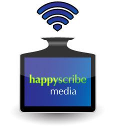
Original Concept:
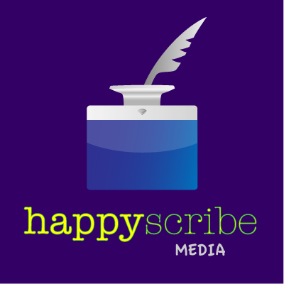
Revised:

6 Answers
James Barnett
39,199 Points3 typefaces on a logo, probably too many.
Wayne Priestley
19,579 PointsHi Ashley,
I really like the new design it looks very clean, well done. My fav is the one with the name inside but the other is nice too. The new logo makes your original look dated somehow.
Ashley Shay
8,664 PointsThanks, Wayne! I agree about the first concept looking dated against this one. I guess that's a good thing. :)
faranaway
Courses Plus Student 13,885 PointsHi,
Great work! Nice approach on using a iMac as your ink container. Have you tried doing an outline of your logo to compare and contrast different styles?
Ashley Shay
8,664 PointsThanks! I haven't tried that - what do you mean by styles, exactly? The colors - or something else?
Thomas Rendleman
Courses Plus Student 9,516 PointsIt's clean.
2,#3, If it is to be on printed media it might be costly for the ink.
Favorite is #3.
I like the separation of colors that looks like a smile (subtle). I might play around with a very light transparency of a child looking toward the camera smiling. My opinion only. I would want to infuse the idea of happy. That can be done with a smiling eye and not just a mouth.
Everyone has their own opinion. Go with your gut. I like it.
Ashley Shay
8,664 PointsThanks, Thomas! I'm pleased you picked up on the subtle smile - I wanted that effect, but wasn't sure it would come across. But that's part of what subtle means, I suppose. :)
Ashley Shay
8,664 PointsHappyScribe is in American Typewriter - Happy is regular and Scribe is light. Then Media is Apple Casual.
Thomas Rendleman
Courses Plus Student 9,516 PointsThomas Rendleman
Courses Plus Student 9,516 PointsCould be but when I look at it I see only 2 typefaces and something that looks written in. Maybe it's just me.:)
James Barnett
39,199 PointsJames Barnett
39,199 PointsI'm pretty sure the something that looks written in is actually a humanist sans-serif kinda like lobster.