Welcome to the Treehouse Community
Want to collaborate on code errors? Have bugs you need feedback on? Looking for an extra set of eyes on your latest project? Get support with fellow developers, designers, and programmers of all backgrounds and skill levels here with the Treehouse Community! While you're at it, check out some resources Treehouse students have shared here.
Looking to learn something new?
Treehouse offers a seven day free trial for new students. Get access to thousands of hours of content and join thousands of Treehouse students and alumni in the community today.
Start your free trial
Maximino Cosme
8,355 PointsWorking on a new design. Help?
So I've been around here for a month and messing with websites for 7 years now. But I still don't understand colors. Is there just something about colors that I can't get? =/ I feel super confident with my coding, but not so great with my choice in colors.
Can you guys help me out with this one in particular?
Don't pull any punches either. ;) This is gonna be for my personal site, so I want you guys to be brutally honest with me. Helpful, of course, but honest. Thank you =)
5 Answers
Steve McKinney
29,274 PointsI'm going to be different and say ignore using the colour wheel. It is helpful I think, but you can literally get any set of colours to eventually work together according to a tool like color scheme designer and you won't really be any better off.
Start simple, use monochrome colour palettes, use 2 or 3 colours at most.
Avoid using shades of yellow, it's a difficult colour to use on the web (my opinion at least).
When choosing a background colour make sure it's darker or lighter than the main content area (hopefully this makes sense)
-- See this site itself, white content area, slightly darker background -- https://news.layervault.com/ - light content area, darker background
- Look at other websites and see how they're doing it, where and how they use the various colours
Look at the top colour palettes on these websites: http://www.colourlovers.com/palettes/most-loved/all-time/meta https://kuler.adobe.com/explore/most-popular/?time=all
You'll hopefully see patterns in what makes them work well. Try apply some to your designs. Pick colours you like from those palettes and try make your own.
Hopefully this helps, it's really hard to get across how to, it's like anything with practice and taking in lots of examples and inspiration you eventually get an eye for it.
Edit: A couple of points about your current colour scheme on your website. The colours you have chosen are too close in lightness and saturation. You need different levels of saturation and lightness.
Here's what I mean I've taken a screenshot of your website and reduced the saturation to 0, it's all one shade of grey pretty much. https://www.dropbox.com/s/ivslkcicqvhg2a1/saturation_0.jpg
Matt Caden
Courses Plus Student 6,588 PointsHey Max, just wanted to share a link I find useful and keep in my toolbox.
http://colorschemedesigner.com/
The interactive color wheel is a great tool when you want to use multiple colors in your design and you can really fine tune the color scheme using the Adjust Scheme Tab. There are also Light and Dark Page examples of how the colors could be used in a design. Hope you find it useful.
Kimberly Bak
Front End Web Development Techdegree Student 3,492 PointsWow Matt, thanks! Great share! I have bookmarked it for later use.
Patrick Cooney
12,216 PointsI agree with Stephen, your colors are VERY muted. It's the type of color palate I'd expect to see on a corporate site that is trying to remain fairly reserved. To be fair, on my personal site I stick to black, grays and white as I've always been a fan of minimalism in my designs.
Treehouse actually has a color theory course of it's own that you can find here
Here are a couple of websites in the spirit of Stephen's suggestion that I happened to have open in my browser:
John Torres
Courses Plus Student 2,853 PointsI can give you some pointers about color usage. It would be better to reference the basics so you have a better undestanding why color combinations work or don't . I think what your site needs is a clear definition of how color harmonies can be defined. There are different ways to combine colors:
Complementary Colors that are opposite each other on the color wheel are considered to be complementary colors (example: red and green).
Analogous Analogous color schemes use colors that are next to each other on the color wheel. They usually match well and create serene and comfortable designs.
-–-------- These are safe bets when creating a color scheme, these next ones are a little more risky.
Triad A triadic color scheme uses colors that are evenly spaced around the color wheel.
Split-Complementary The split-complementary color scheme is a variation of the complementary color scheme. In addition to the base color, it uses the two colors adjacent to its complement.
Rectangle (tetradic) The rectangle or tetradic color scheme uses four colors arranged into two complementary pairs.
Square The square color scheme is similar to the rectangle, but with all four colors spaced evenly around the color circle.
When dealing with the last group, the use of black or white can make or break a site. Try to keep text and backgrounds and text also in neutral colors. Try first adding as little color as possible and build up using these color theories.
Maximino Cosme
8,355 PointsMany thanks =) a solid answer.
Maximino Cosme
8,355 PointsI've done the color theory course. My problem is that I learn more with a project based approach when it comes to abstract things like color.
I really appreciate the feedback. It helps a lot. A few questions though, if I may.
How can I use the color wheel effectively? I tinkered around with it when putting this design together and got some colors and used those, but wasn't much of a fan of what I made, so I went with a more muted look. How do I know I'm using the wheel right? And, really, is there even a wrong way to use it?
As far as design trends go, can someone explain to me exactly what "flat design" is? I've seen it all over Twitter but everyone's talking about it, not explaining it... =/
One last question: As far as the colors I did choose for this design, did I do well? Do these colors work together? Is this an appropriate amount of color? Is it in the right place? I just want to know I'm improving. My first design was all dark blue... It was torture to make and to look at... =/ but we all have to dare to suck if we dare to get better, right?
Thank you both =)
Patrick Cooney
12,216 PointsFlat design refers to, well, making things look flat. Large blocks of color with no texture, not using drop shadows or gradients to add depth, etc. It's also the death of the UI that tries to recreate the subtlety of the details of the object it's supposed to replace(i.e. a compass app that looks like a compass face). Your website could be considered flat design if you removed drop shadows and the texture in the background.
There isn't really a correct way to use the color wheel per se, you just kinda move around until you find colors you think look good together.
Richard Duncan
5,568 PointsYou can still use shading and shadows in a flat design but not overdoing it is the key. Check out Apples OS 7 very subtle shadow on the keys for the keyboard and shaded grey lightbox when one window overlaps another. http://www.apple.com/uk/ios/ios7/
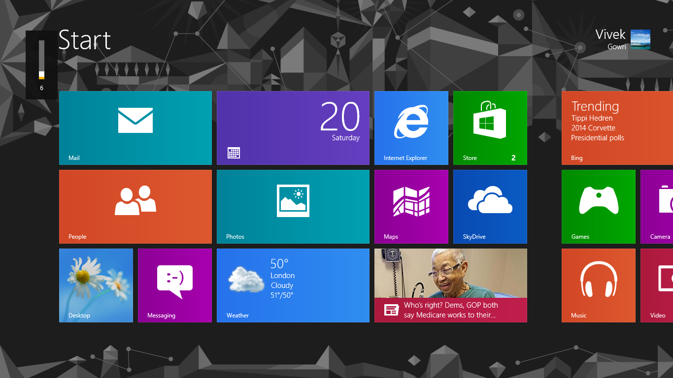
You can use blocks of color with a texture as a background as seen on Windows 7 Start screen: - http://images.anandtech.com/doci/6392/Screenshot%20%281%29.png
At least this is my understanding of it. An extreme minimalist design may be completely flat and clean which is what I attempted to achieve with http://just-becky.co.uk.
Patrick Cooney
12,216 PointsI guess I misunderstood. My understanding was that it mostly describes using solid blocks of color unbroken by gradients or textures and lacks anything that would give the effect of 3D such as a drop shadow. When I say texture I'm referring to adding noise or something similar to an image in photoshop. I've always thought that adding noise sort of gives the background a feel similar to that of a matte wall paint. That bumpyish texture.
But I mean, as with most things in the design world (print design included), you can ask 5 designers what flat design is and get 5 different interpretations.
Stephen Shivers
1,056 PointsStephen Shivers
1,056 PointsHi Maximino, Yeah the colors don't really stand out to me. The current (flat design) trend is more focused on bolder colors: http://flatuicolors.com/. Beyond whatever the current trends happen to be, a good understanding of color theory would probably be useful to you. Adobe offers a color wheel in their Adobe Kuler web app which helps you choose complimentary or compound color schemes: https://kuler.adobe.com/create/color-wheel/. Plus you can see other users' color themes https://kuler.adobe.com/explore/most-popular/?time=month
I hope that helps!
http://webdesign.tutsplus.com/articles/design-theory/an-introduction-to-color-theory-for-web-designers/